Introduction
Every brand has a story to tell. And whether the pushed brand identity will correlate with brand perception, will depend on how this story is told. Visual storytelling has the power to radiate a strong, long-lasting message , that can result in a better conversion rate and exposure. It is needles to say, then, that graphic designers, marketers and creative agencies, alike, are spending a significant amount of time and financial resource to create compelling stories, with a view to entice their new and existing customers to successfully push their product/service.
So, how do you execute visual storytelling, the right way? Lets start with the basics, shall we?
1. Captivating Message
Arguably the most important component of Visual Storytelling, is a word, for in its absence, no story can be told. From Nike’s ‘Just do it’ to Churchill’s ‘Keep calm and carry on’ – a strong message has proven to have the capacity to empower nations and create movements. The key to a captivating, powerful message is to capture everything that your brand/product/service stands for, in a short , subtle sentence that will leave a long-lasting impression and an emotional attachment.
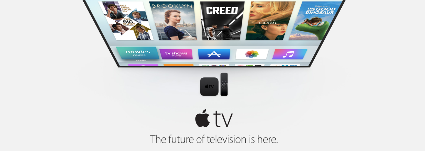
Apple has always been an eloquent crafter of short, yet profound messages that perfectly captured their brand identity and enticed the reader to learn more about their products. The second most expensive company in the world owes a lot of it’s success to a skilful utilisation of visual storytelling in their marketing mix.
2. Typeface
So you have your message – what next? It is essential to display it in an aesthetic way that will reflect the message and your brand, as a whole. The good news is that you are spoilt for choice, as the typeface has gone a long way from the first system font in 1984, to over 90,000 typeface styles available today. Many brands have created their own fonts, to make them a part of their brand identity and create a subconscious connection between themselves and the font. This way – no matter what is written in the font – it can be unmistakably identified.
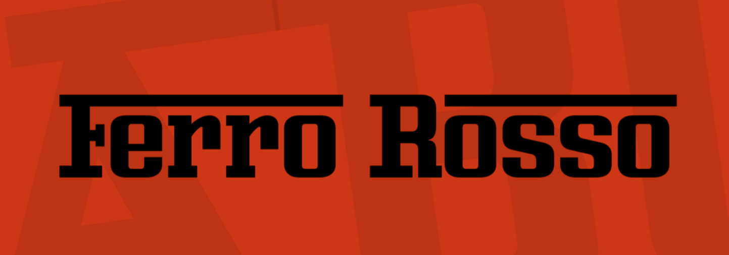
Ferrari is an iconic company with a rich history and was named the strongest brand in 2013, ahead of Apple and Coca Cola. The Ferro Rosso font (Red Iron), creates an unmistakable brand connection to Ferrari, regardless of what is written in it. It also reflects the company’s sporty, sexy and bold identity.
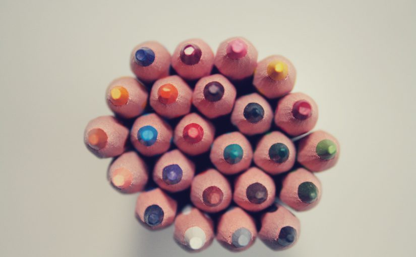
3. Vibrant Colour
Colour plays a paramount role in visual storytelling, as it is capable of evoking different emotions and associations, on a subconscious level. Numerous psychological studies have shown that we have different responses to individual colours: blue is associated with ‘safety’ and ‘stability’, thus usually adopted by companies in the financial, technology and energy industries (IBM, GE and JP Morgan). Red, on the other hand, is associated with ‘excitement’ and used by brands, trying to promote themselves as active and fun (CocaCola, YouTube and Nintendo).
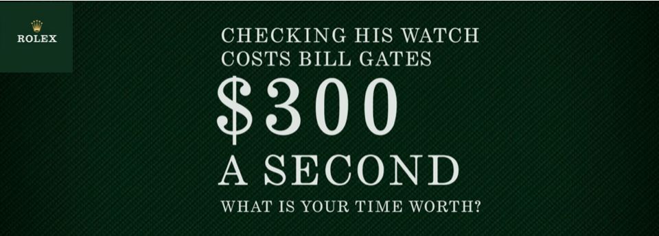
Rolex has always positioned itself as a brand for wealthy and sophisticated clients, which is reflected by the colours that the company uses. The dark green provides a luxury and sophisticated feel that reflects and reinforces the message in the advertisement, below.
What Next?
Applying theory, to practise, can be easier said than done. So why not entrust us with it? Find out how our creative wizards can help you, today!